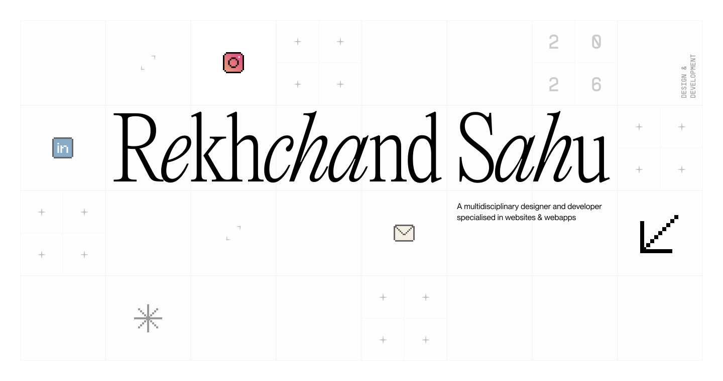
Recently, I have been playing around with grids, gutters, and margins. I had a lot of fun trying out different compositions and seeing how a grid affects elements and the overall feel of a page. For this portfolio, I went with an 8-column layout with adjacent columns and no gutter.
A portfolio built strictly on a rigid grid often feels cold, more like a spreadsheet than a personal space. On the other hand, if you throw structure out the window completely, things get messy fast. My goal was to find a middle ground: use the grid as an invisible baseline for order, while giving elements enough freedom to shift, stagger, and feel alive.
Starting with one single unit
Instead of grabbing a standard 12-column framework with random rem margins, I wanted the entire layout to grow out of one single number. Every measurement on desktop starts with this CSS variable:
:root {
  --container-spacing: 2.5rem;
  --box-size: calc((100vw - var(--container-spacing) * 2) / 8);
  --font-s-h1: var(--box-size);
}
The desktop screen splits into an 8-column grid (.main-grid-8) with zero gap between columns. Because my main display font size (--font-s-h1) is tied directly to --box-size, the height of a headline matches the exact width of a single column. The type doesn't just float on top of the layout—it shares the exact same proportions as the grid underneath it.
Bending the vertical line
Once the horizontal lanes were locked in, I started bending the rules on the vertical axis. Instead of lining project cards up in neat, predictable rows, I pushed them up and down using fractions of that same --box-size unit:
.collection-card {
  grid-column: span 2;

  &:nth-child(6n - 5) { grid-column: 1 / span 2; }
  &:nth-child(6n - 4) { grid-column: 4 / span 2; margin-top: calc(var(--box-size) * 1.8); }
  &:nth-child(6n - 3) { grid-column: 7 / span 2; margin-top: calc(var(--box-size) * 0.7); }
  &:nth-child(6n - 2) { grid-column: 1 / span 2; margin-top: var(--box-size); }
  &:nth-child(6n - 1) { grid-column: 4 / span 2; margin-top: calc(var(--box-size) * 2.4); }
  &:nth-child(6n)     { grid-column: 7 / span 2; margin-top: 0; }
}
Staggering the top margins immediately breaks that flat horizon line. Still, static offsets were only half of what I wanted; the layout needed to move.
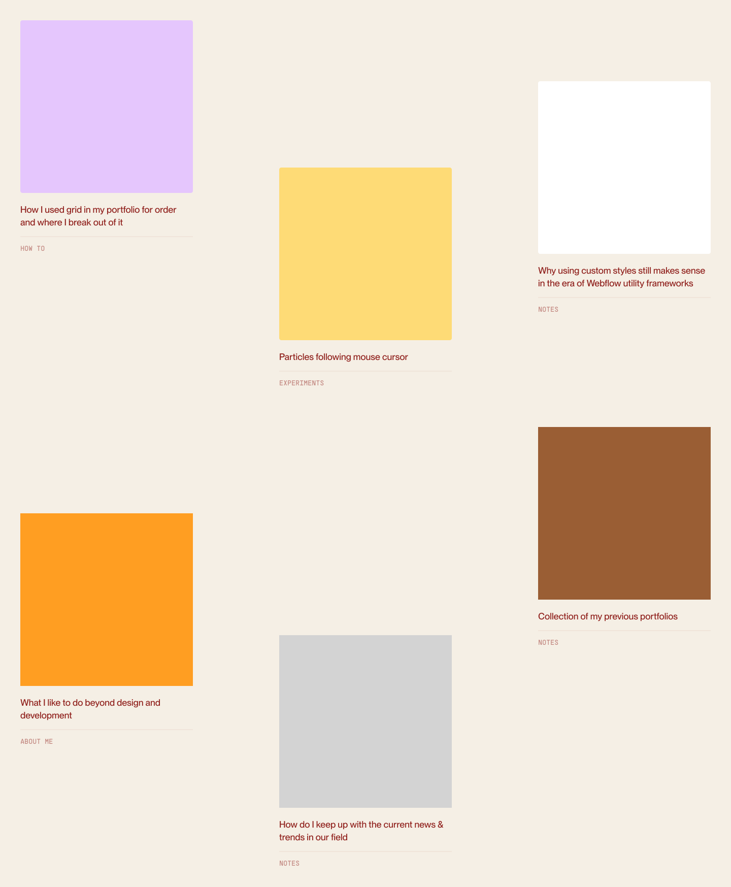
By giving neighbouring columns different parallax speeds (data-parallax-speed="0.8" vs 0.2), cards slide past each other at different paces as you scroll. They stay strictly inside their horizontal lanes, even as their vertical positions shift around you.
Turning the Blueprint into a Playground
On most pages, the grid just does its job quietly in the background. On the About page, though, I wanted to pull the curtain back and put the grid front and center.
.hero-about-contain {
  --about-box: calc(var(--box-size) * 0.5);
  display: grid;
  grid-template-columns: repeat(16, 1fr);
  grid-template-rows: repeat(8, 1fr);
}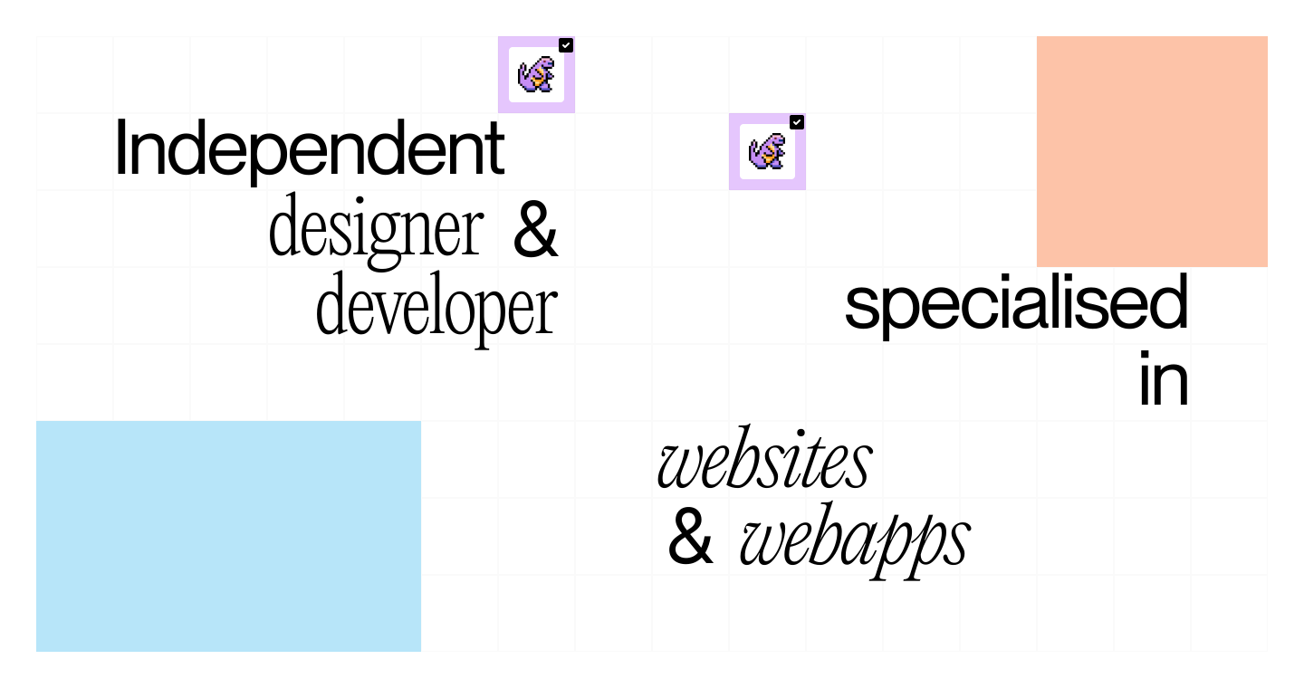
Here, the hidden framework becomes a visible 16×8 grid of square tiles. Rather than leaving it as a static wireframe, I turned a few of those tiles into 3D flip cards with subtle sound effects. The layout skeleton stops being just a structural tool and turns into something you can actually click and play with.
Wrapping up
A grid shouldn't force every piece of work into identical boxes. When you treat it like a quiet rhythm in the background instead of a strict rulebook, you can let things drift, speed up, or sit in empty space, knowing the whole page will still hold together.